Nov 20, 2024

How HEX redesigned Replo from the ground up

Creative director + Founder of HEX Studio

Replo is the single most robust, conversion-focused platform for Shopify teams to set up, measure, and test winning campaigns used by thousands of brands and agencies daily. Rapidly scaling, launching new features and reaching new heights, Replo found themselves with a marketing site that felt increasingly irrelevant and outdated.

After a review of the current website with their team, it made the most sense to bring their web presence onto Webflow (where non-technical people can manage the site). HEX studio worked with the Replo team to redesign their site from the ground up, eliminating waste and doubling down on customer-centric resources.

What we did

Design

  • Strategy

  • Imagery

  • Responsive Design

Development

  • Webflow Implementation

  • CMS

  • Training

Sitemap and Strategy

Since a big ask on this project was to cut down as much as possible on the website while maintaining cohesiveness, we worked with the team to really understand Replo’s core priorities and how they’re looking to structure content.

We trimmed down legacy pages and pointed high-traffic ones to our new structure, created a revamped hierarchy for customer solutions & resources, and set up a simplified sitemap that served Replo’s current needs without sacrificing their older high-performing content.
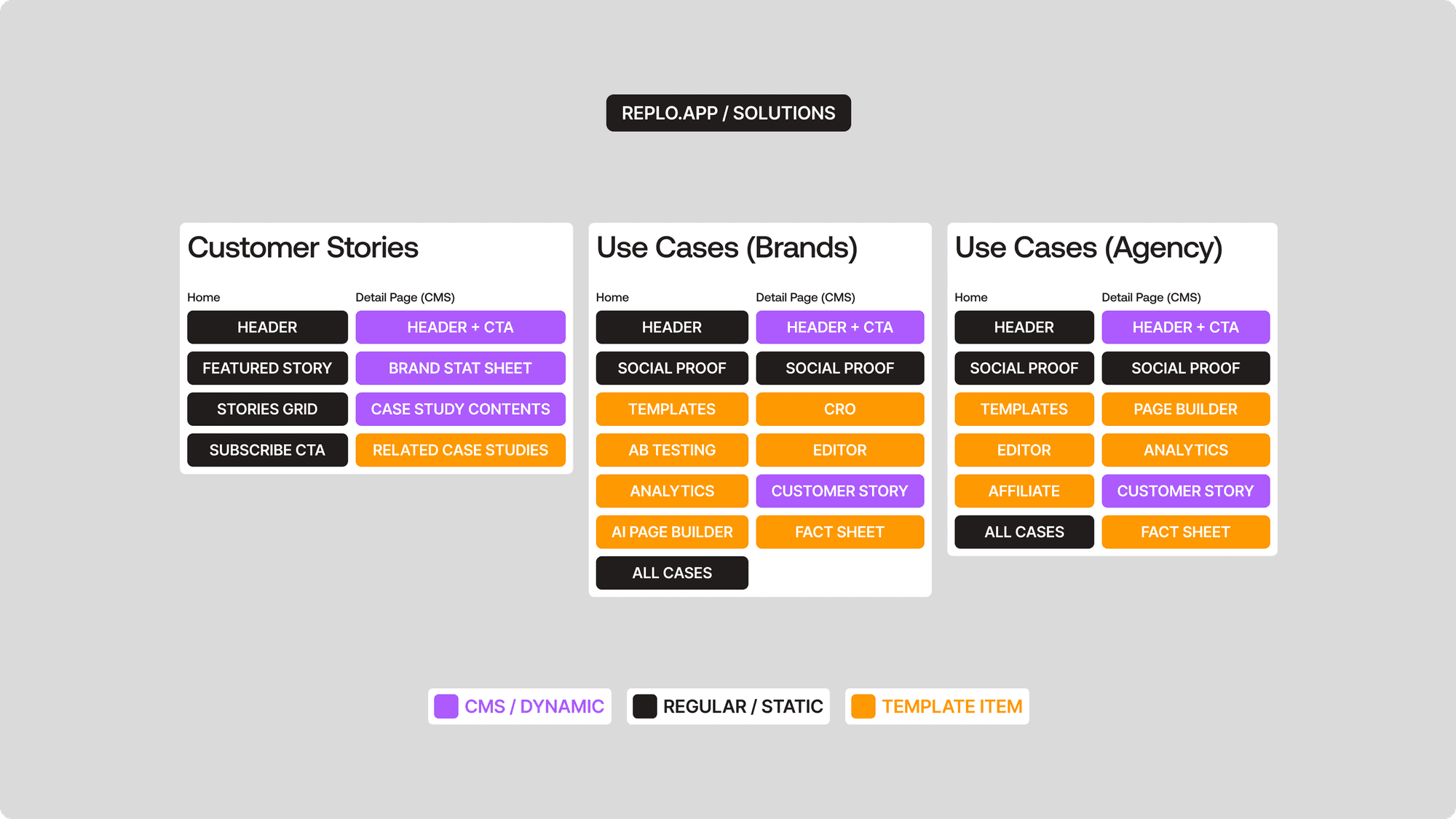
We laid out all of their web content and pages, prioritized the sections that drove conversions, and re-packaged the website with just those. We also laid down a general page content structure that we can use in the later stages of this project.

Low Fidelity Design

After deciding on our final sitemap and content structure, we started laying out the content of the website visually. This stage is extremely important as it allows us see how the information flows across pages, so that we can make tweaks to the hierarchy of contents at an early stage.
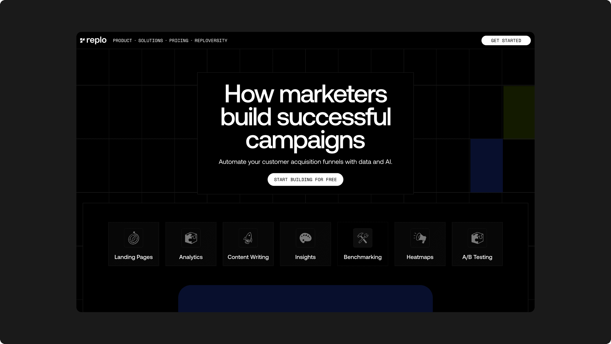
I often hear that our low fidelity designs aren’t exactly low fidelity… That might be true. I feel like a completely blank and trimmed down design doesn’t really help move the needle much.

It’s really just a sitemap at that point. I’d much rather design a first-draft where you can feel your content and website than play with grey-ed out boxes and leave it up to imagination.
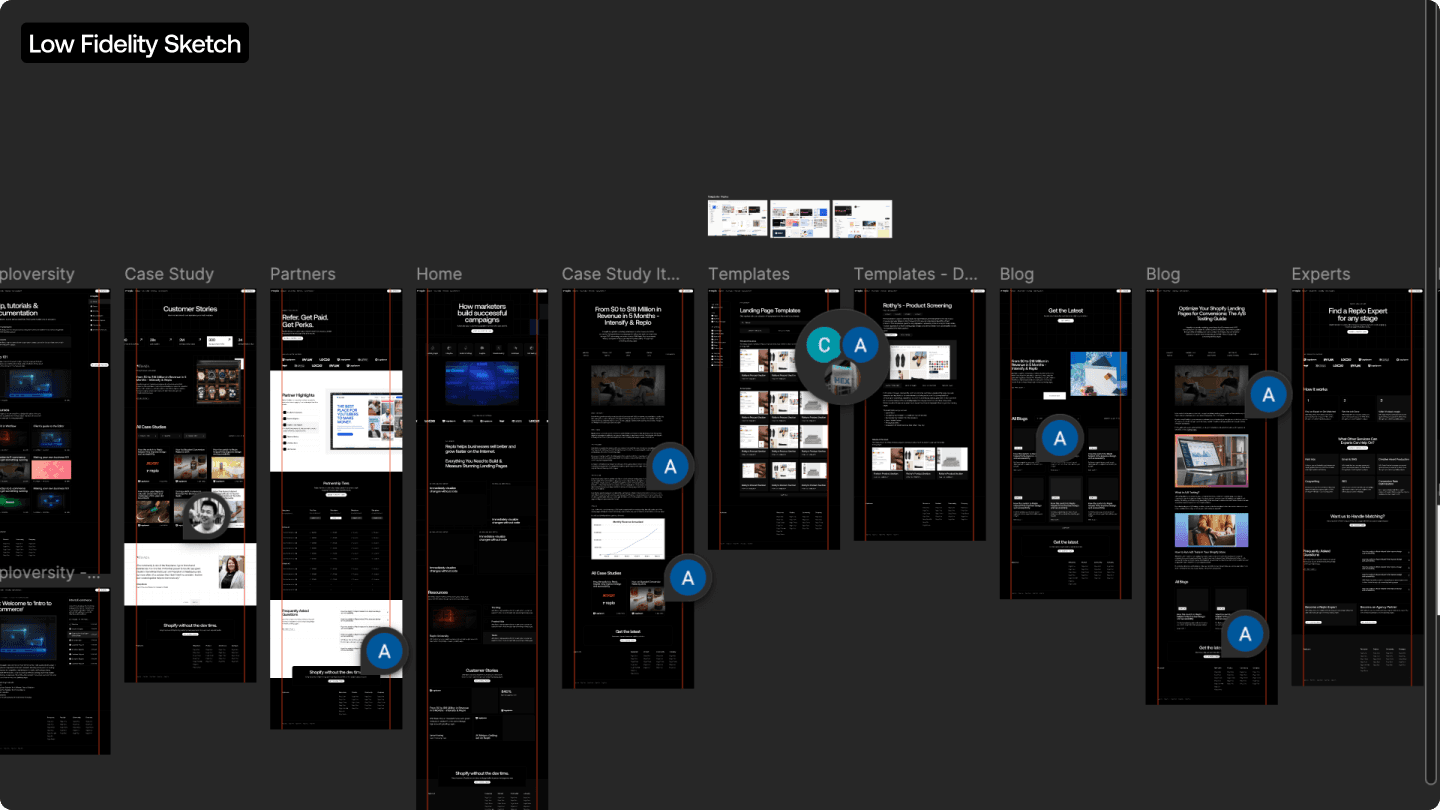
Our low fidelity structure included the layout structure for key website pieces — case studies, blogs, product pages, solutions, template marketplace. From there, we iterated on how layouts can be optimized for conversions and how we can keep traffic to stay on the website by strategically placing relevant content.

Style Explorations

While Replo had a pre-existing brand guide and design system in place, it wasn’t being used consistently across the current website.

The Replo team also didn’t feel too strongly about the design system and visual identity that they were using, and was open to change as long as it wasn’t a full 360.
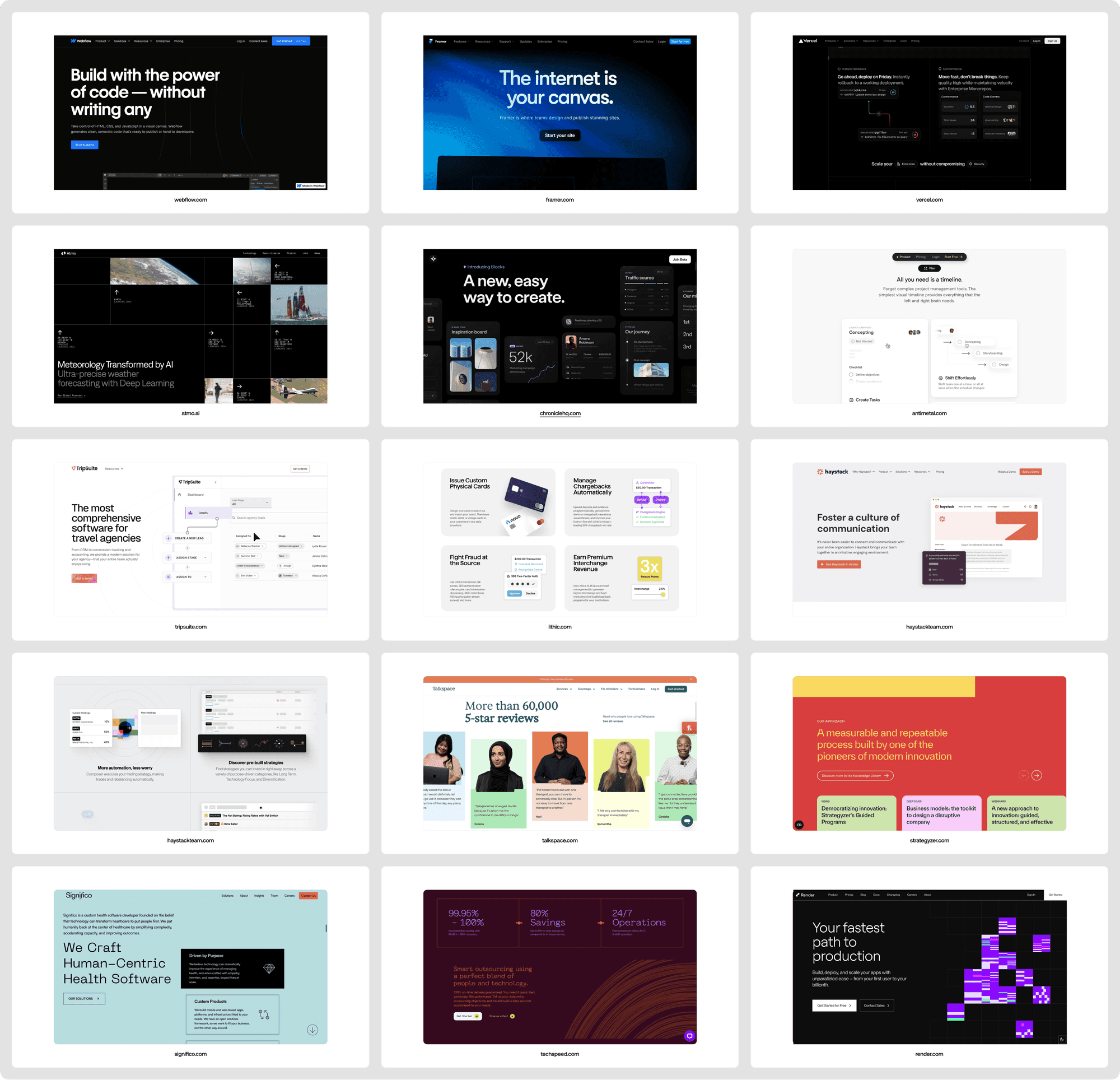
This was a new challenge but a fun one.

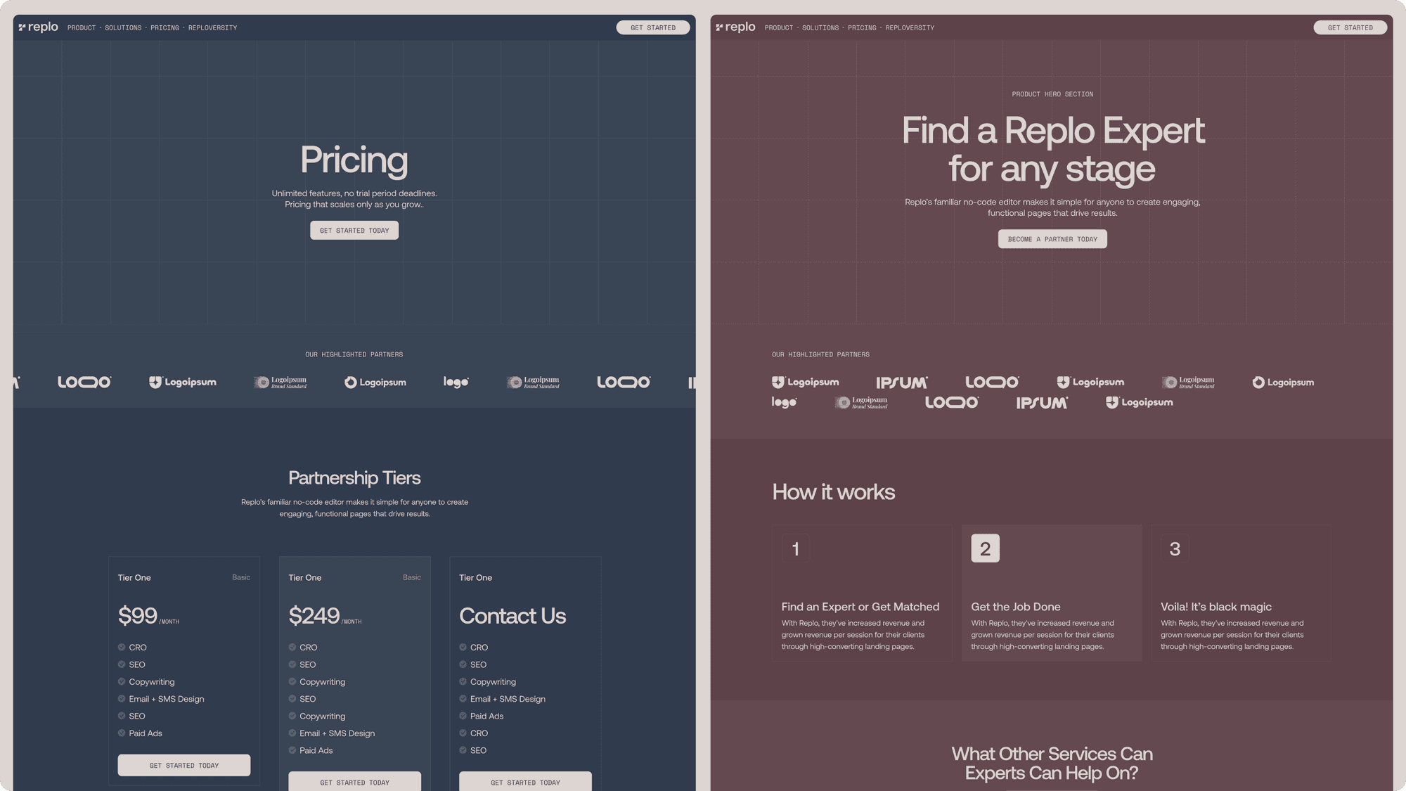
We explored a range of visual ideas and directions stemming from their old brand guidelines, mainly ways to extend it into the new website. The dark mode from the low fidelity sketch ended up becoming an option here as well.

My personal favourite was this experimental, “dull” concept we designed for them.
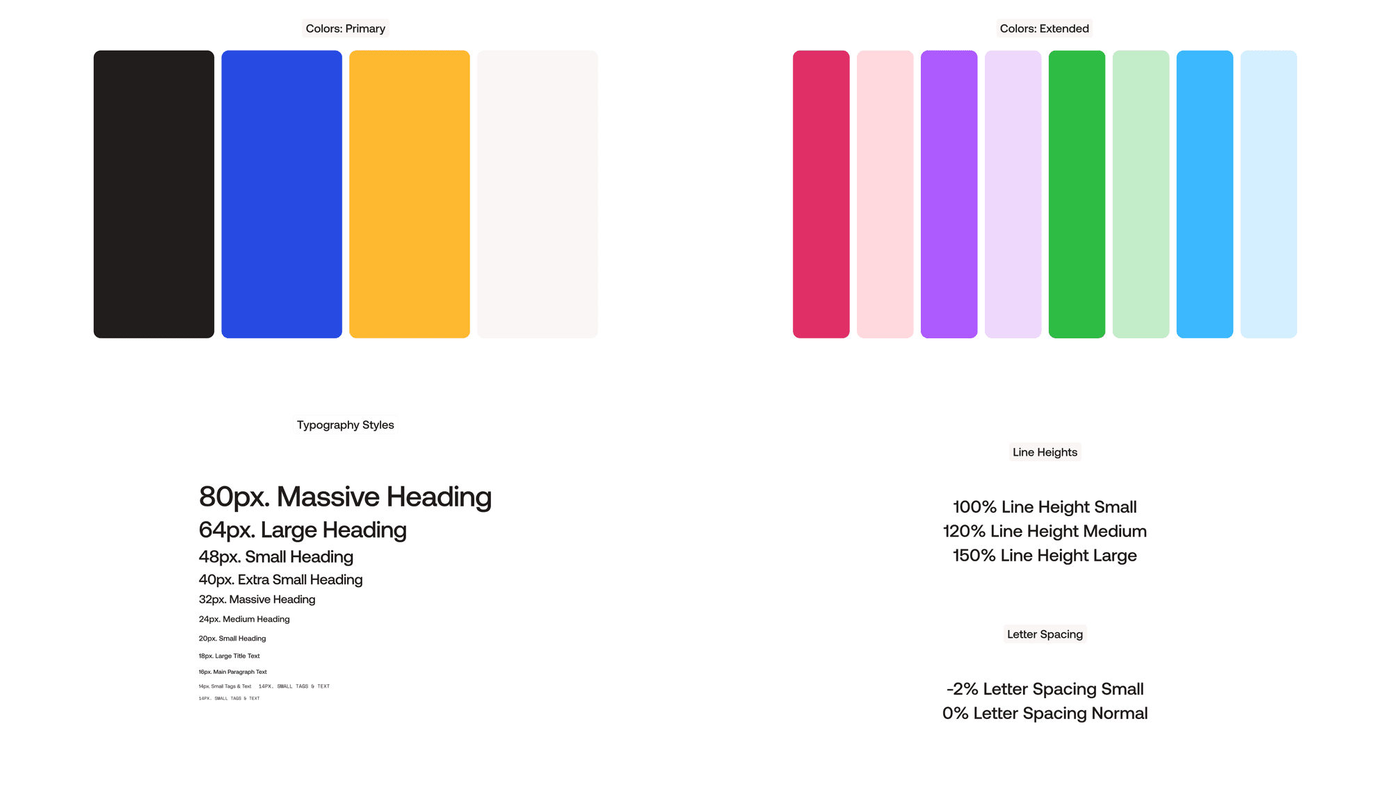
We ended up going with a more playful style that was instantly recognizable as Replo. It was an extension of their existing brand system and typography, with slight adjustments to the shades.
High Fidelity Design

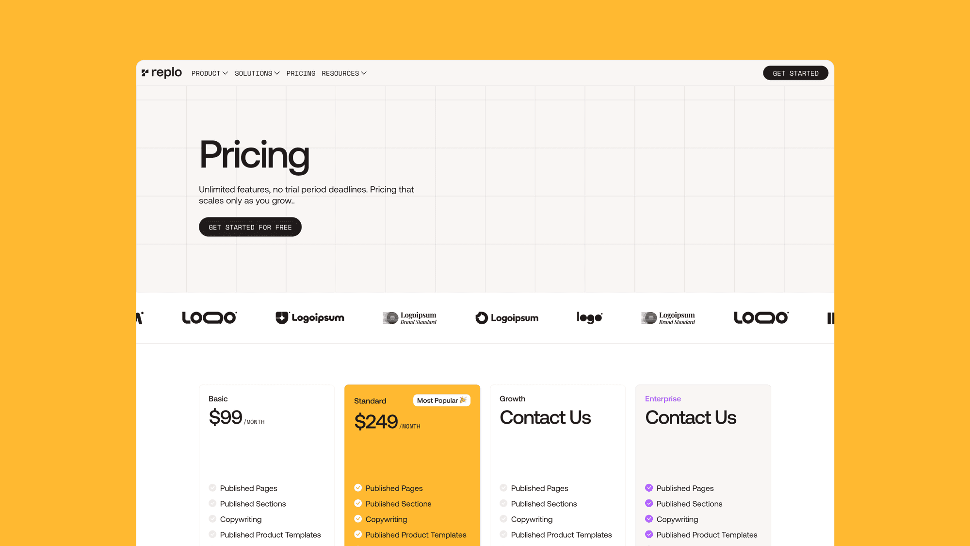
Using the new stylesheet, we designed the new and improved website for Replo, rethinking each layout and improving the user experience at each step of the way.
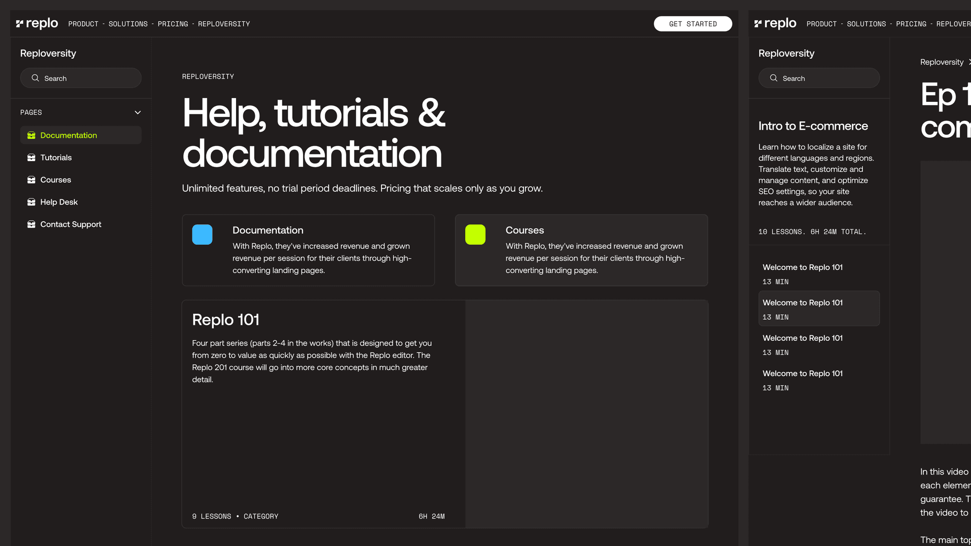
Replo’s team gave us full creative freedom with the design language, and we took advantage of that by bringing in dark mode for Reploversity, which is Replo’s central education hub.
Our main goals with this new design was to ensure that it could be applied at scale. In a large website like this, there are hundreds of things that can go sideways: styles get lost, new spacings get invented, and layout rules get broken.

With each layout, we made sure that it could be easily replicated without much effort by re-using spacings and text styles at scale.
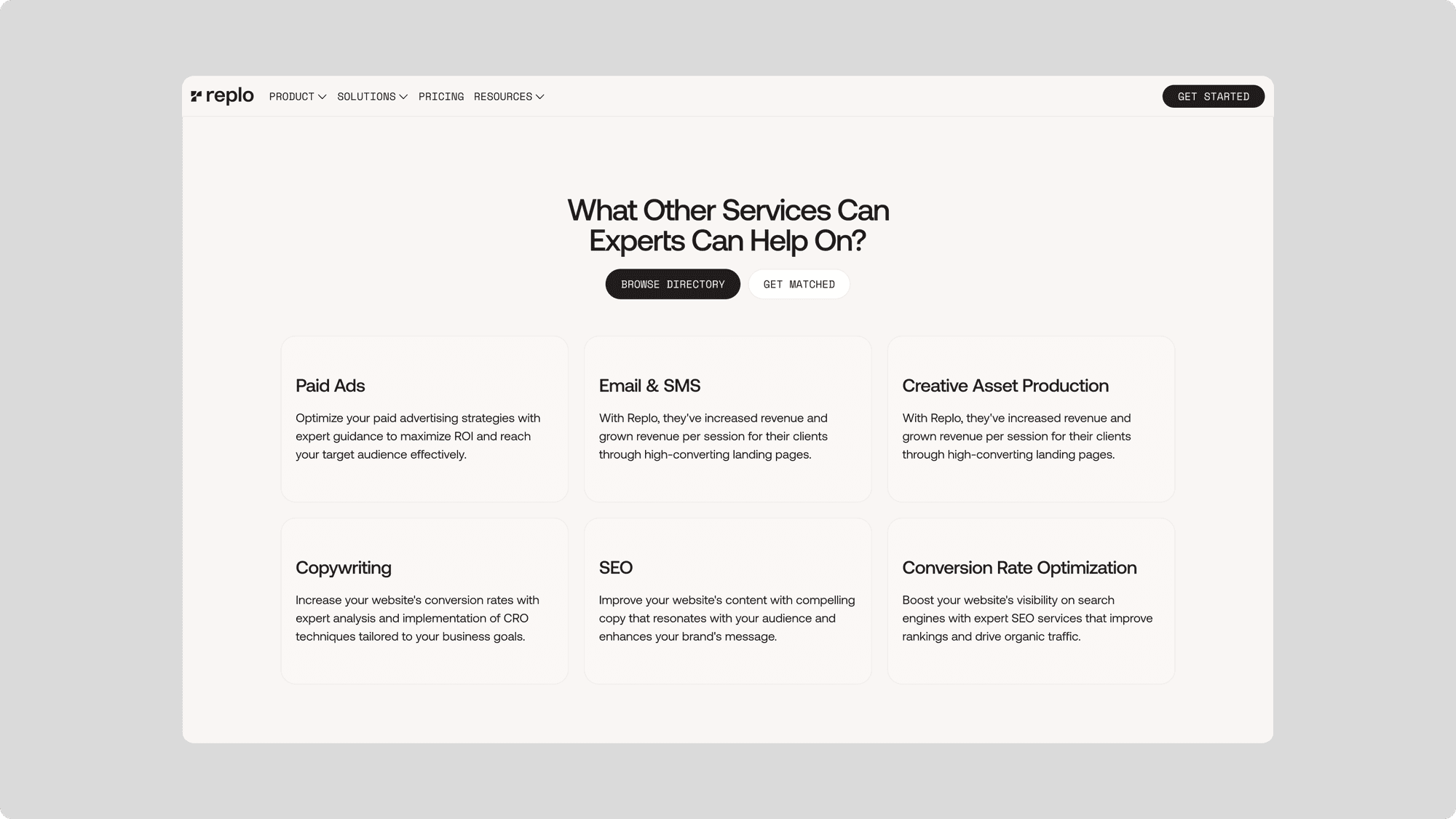
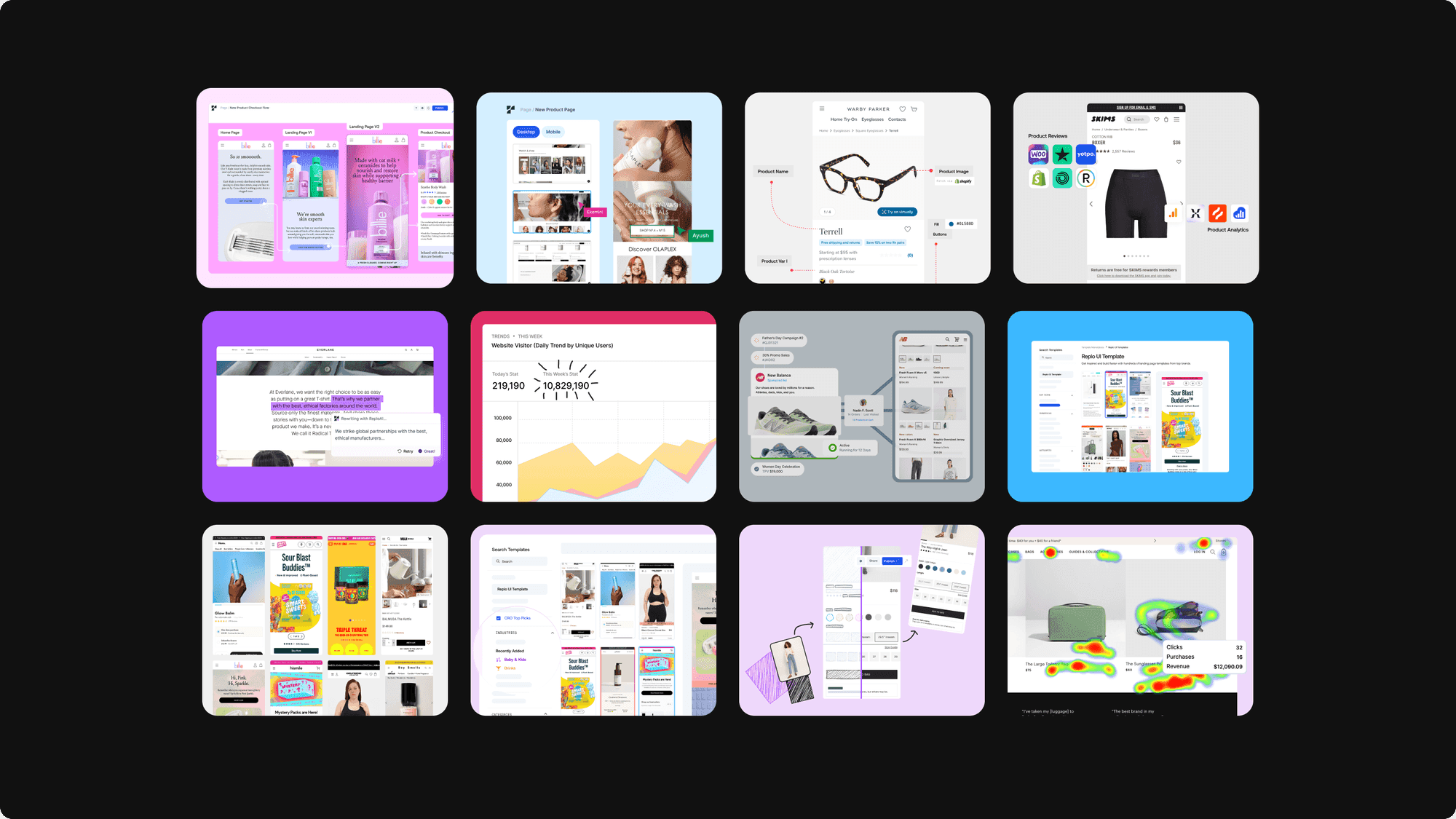
Product Illustration

A core focus of this website was to highlight Replo’s increasingly superior product offerings, from the powerful on-page editor to the upcoming AI content tools.

We took each product and feature and visualized it’s core offering into a simple, easy to understand graphic.
Webflow Development

The website development included a site-wide migration of Replo’s dynamic content from their existing CMS, including critical pieces like: the blog, Reploversity, integrations gallery, experts directory, template marketplace and more.
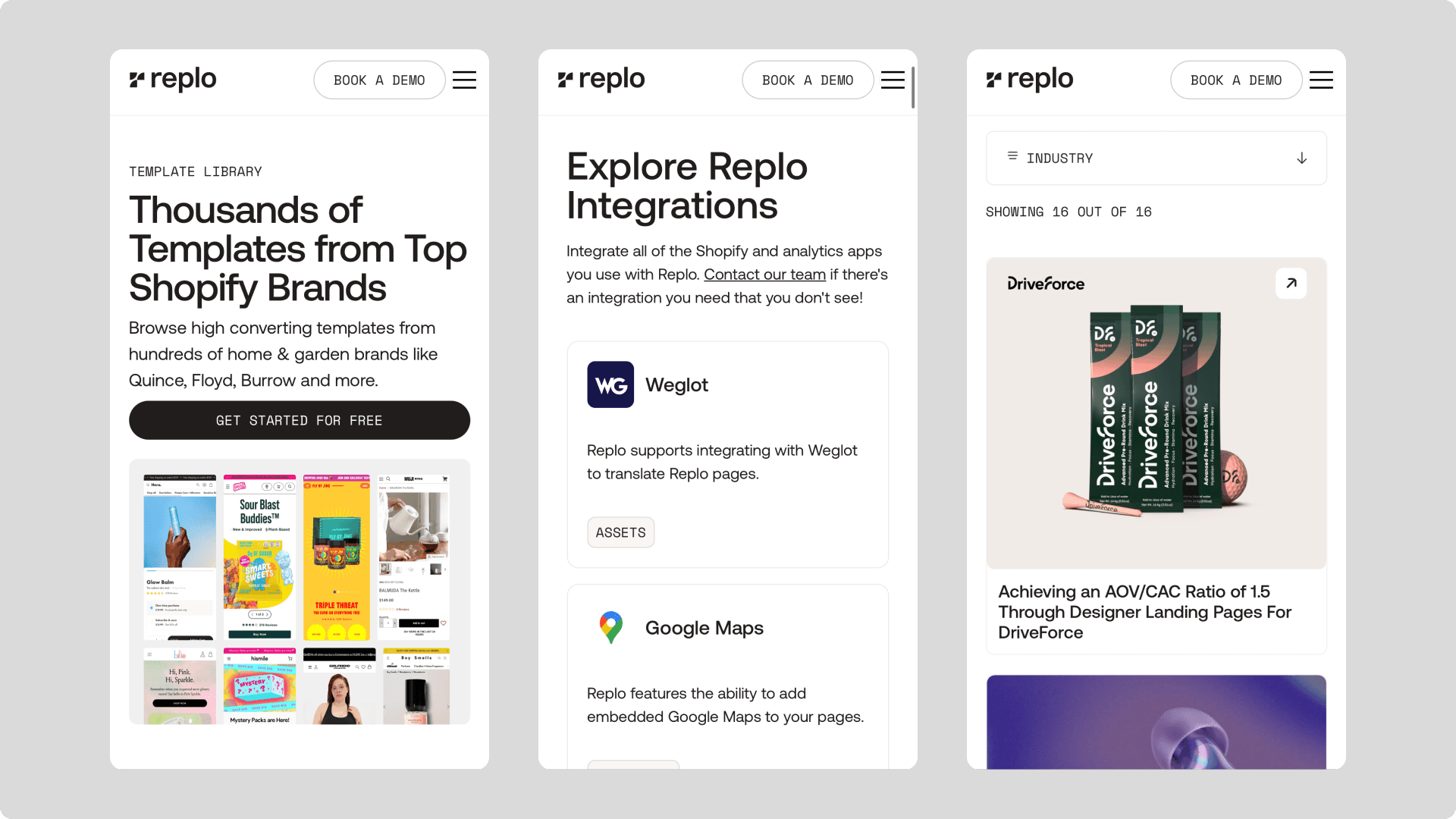
Each of these collections were dynamically set up within Webflow and enhanced with custom code. Here are some of the highlight features we implemented as a part of this revamp.

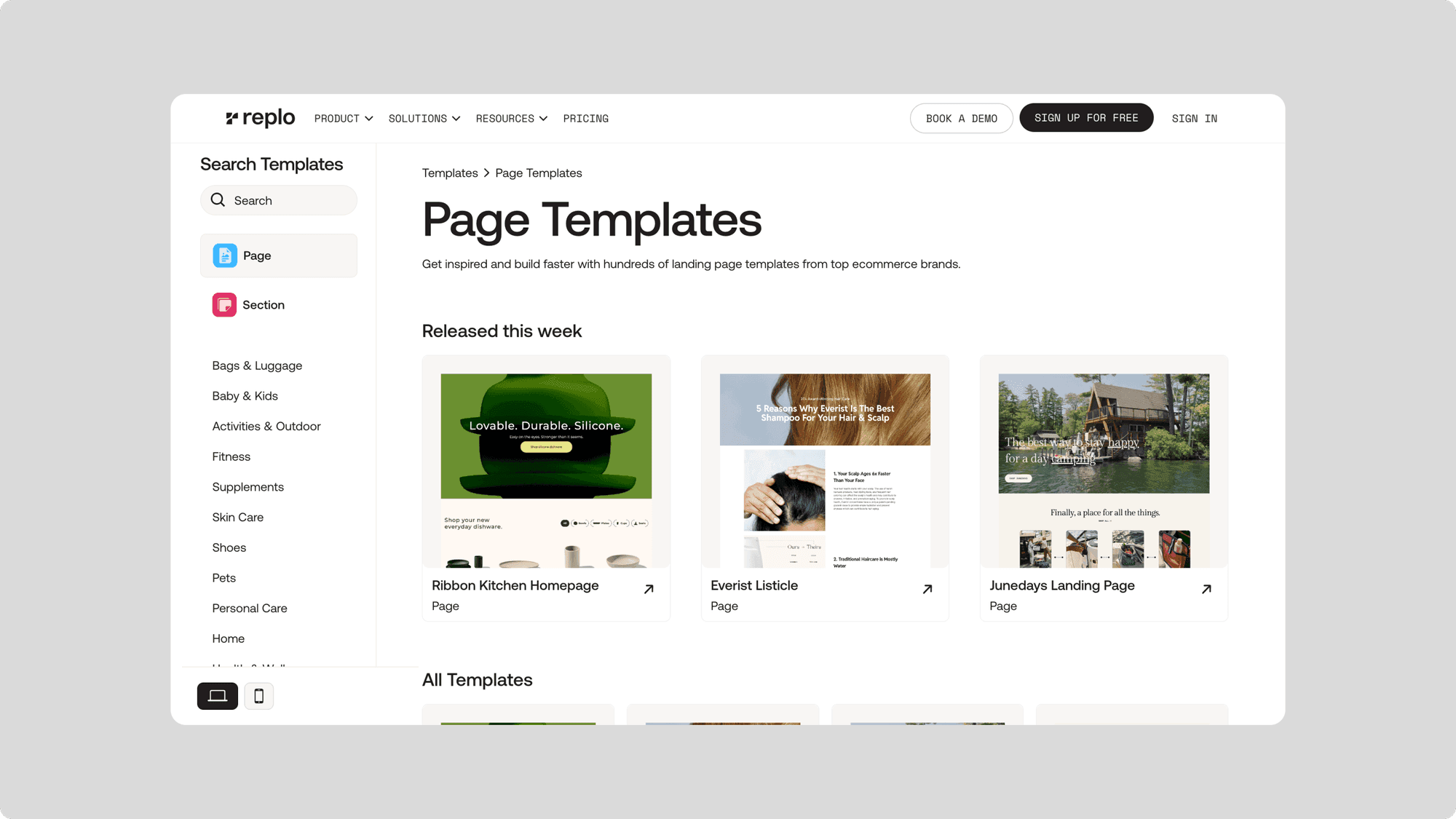
CMS Powered Template Gallery

Replo has a massive gallery of page and section templates they offer to their users to duplicate into their projects. We set up a dynamic sidebar with filters to enable users to navigate their marketplace.
Template Pages for products and solutions


‍We set up Webflow’s newly released Template Pages to help Replo manage their use case and product pages. Since these pages were too complex for a CMS, we enabled Replo’s team to re-use the layouts by using the Template master page
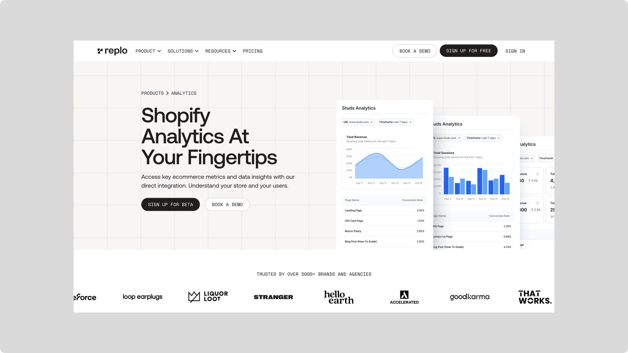
Reploversity’s Dark Mode

We brought in dark mode without having to add any extra styles with the magic of custom code, enabling the Replo team to keep adding content and layout to these pages without having to worry about “changing them to dark mode”

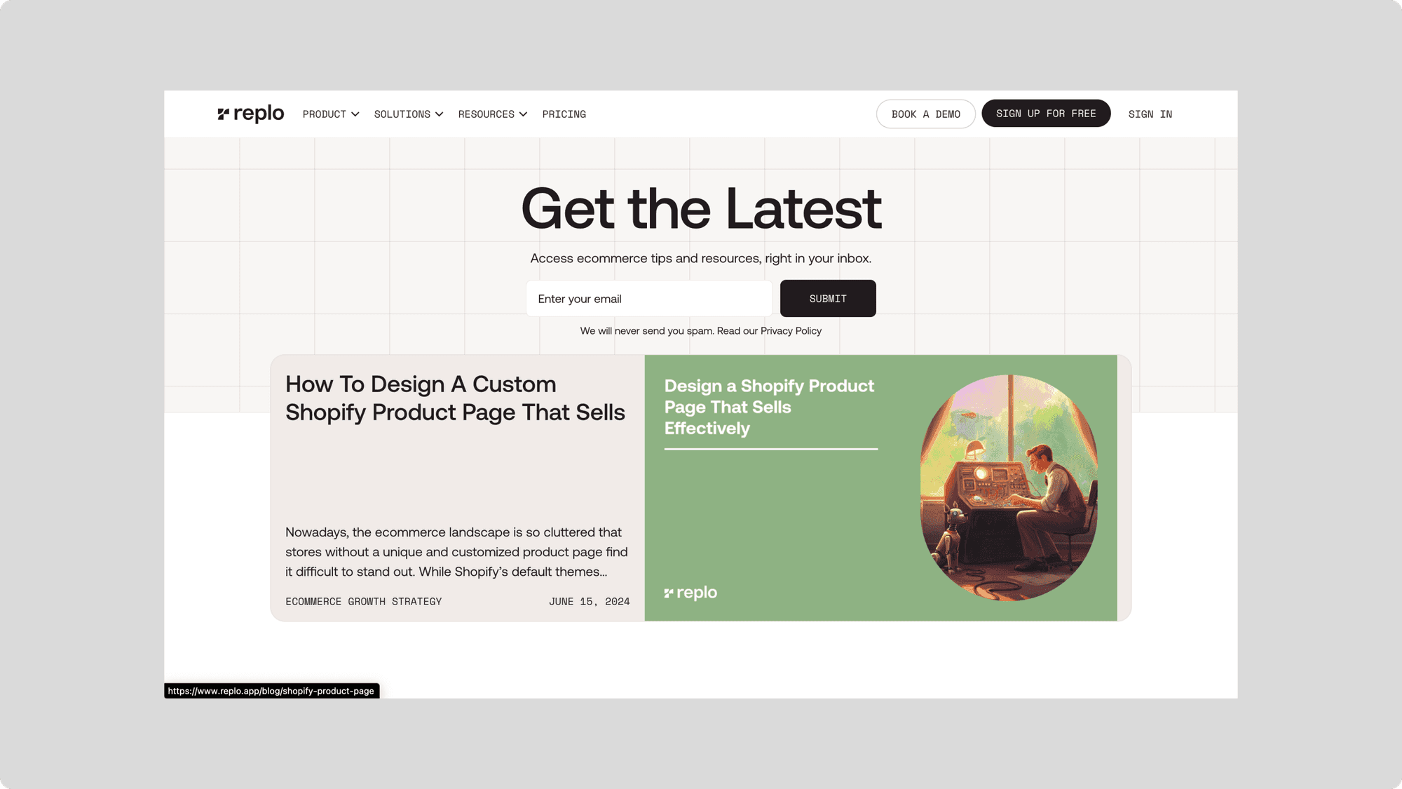
Moving the blog

We enabled a seem-less resources section that allows Replo’s web content to be filtered and viewed using CMS tags. We moved hundreds of pages and set them up for success by optimizing SEO settings.
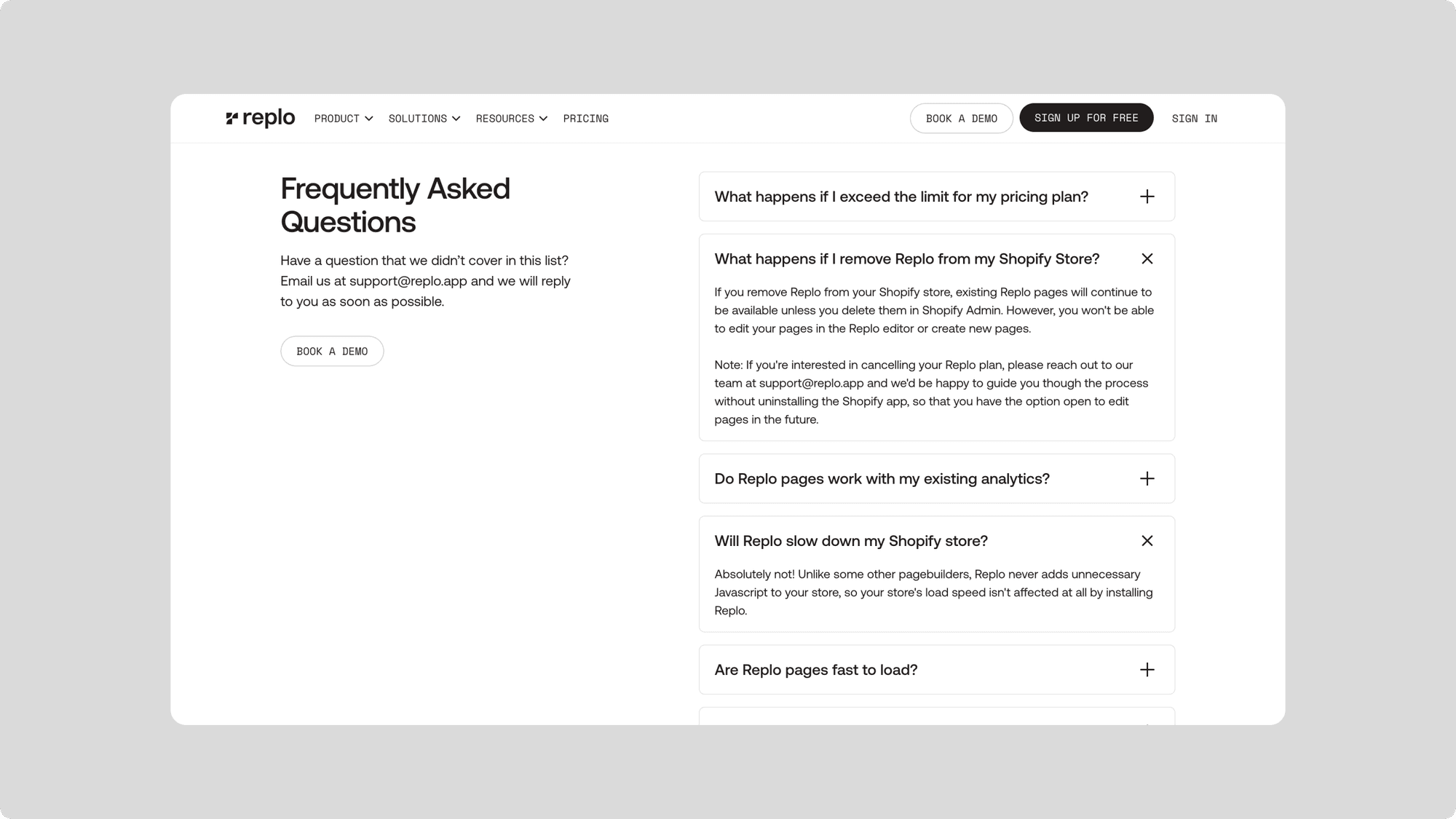
CMS-powered FAQs

Sometimes, FAQs need their own collections. With tags and CMS filtering, we allowed the Replo team to feature relevant product insights on different pages.
Landing Pages

We enabled the Replo team to set up, AB test, and launch landing pages within the Webflow ecosystem.

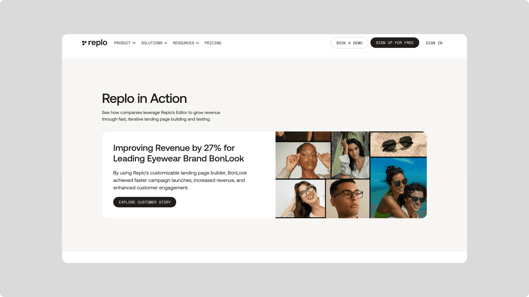
Symbol-led CTAs

Since Replo’s CTAs need to be optimized and customized for different content sections, we set up symbols which allowed them to easily cater the copy, messaging, and links for each call to action.

We also hooked them up to their Use Cases CMS so they can quickly set up customer story CTAs. Finally, we integrated the CTA blocks into rich text so they can implement them on content pages and blogs.
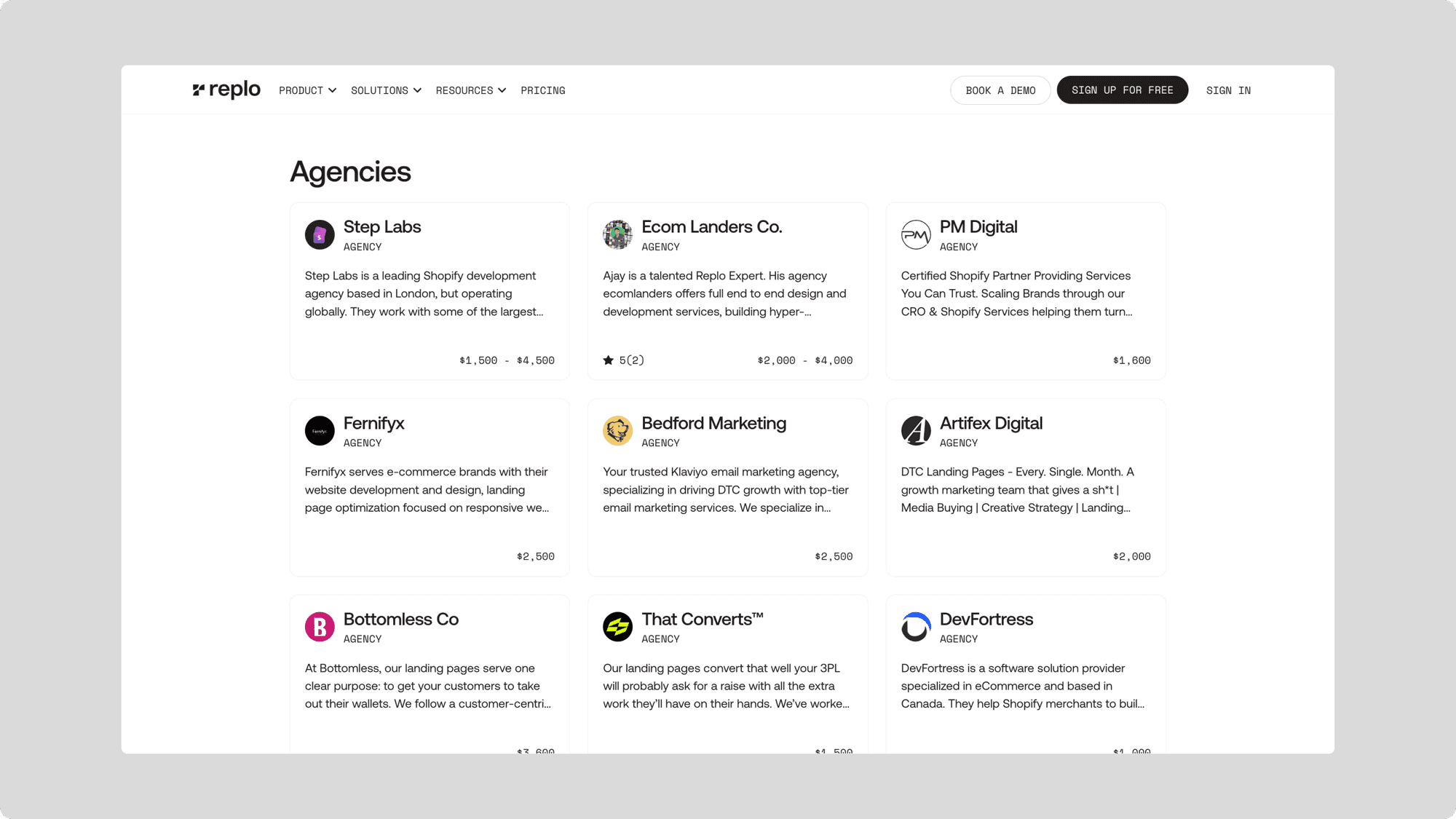
Experts Directory

We set up a custom CMS-powered experts directory for Replo’s leading agencies and freelancers to list themselves.
Final Thoughts

Like any other large website migration, this was a tedious task with a lot of moving pieces. We’re happy to have been able to collaborate with the incredible team at Replo, and stoked about the new website that’s out now.

Big shout-out to the entire team over to Shais and Ekemini for helping out, as well as the rest of the HEX team. Finally, thanks to Yuxin, Aaron, Alicia, and the rest of the Replo team for being incredible partners to work with.

The website is currently live at replo.app.

Join 10,000+ designers

Get our weekly breakdowns

"There's no doubt that Dive has made me a better designer"

@ned_ray

Join 10,000+ designers

Get our weekly breakdowns

"There's no doubt that Dive has made me a better designer"

@ned_ray

Join 10,000+ designers

Get our weekly breakdowns

"There's no doubt that Dive has made me a better designer"

@ned_ray

"

I've been binging Dive Club lately and the quality is nuts

Literally the only show about design I watch”

Eugene Fedorenko

"

I've been binging Dive Club lately and the quality is nuts

Literally the only show about design I watch”

Eugene Fedorenko

hello@dive.club

Ⓒ Dive 2024