Oct 10, 2024
Break up your wall of love

Creator of Dive
I recently designed and built a website for one of my new favorite products (there’s even a custom landing page for Dive Club listeners 🤿).
So I wanted to give a little behind-the-scenes and unpack some of my strategy for the site.
Because I look at a lot of websites for design inspiration and there’s an opportunity that almost everyone misses 👇
The "Wall of Love"
Somewhere along the line we decided that the way to showcase testimonials on a website was to dump them into their own section.
Most of the time it looks something like this 👀
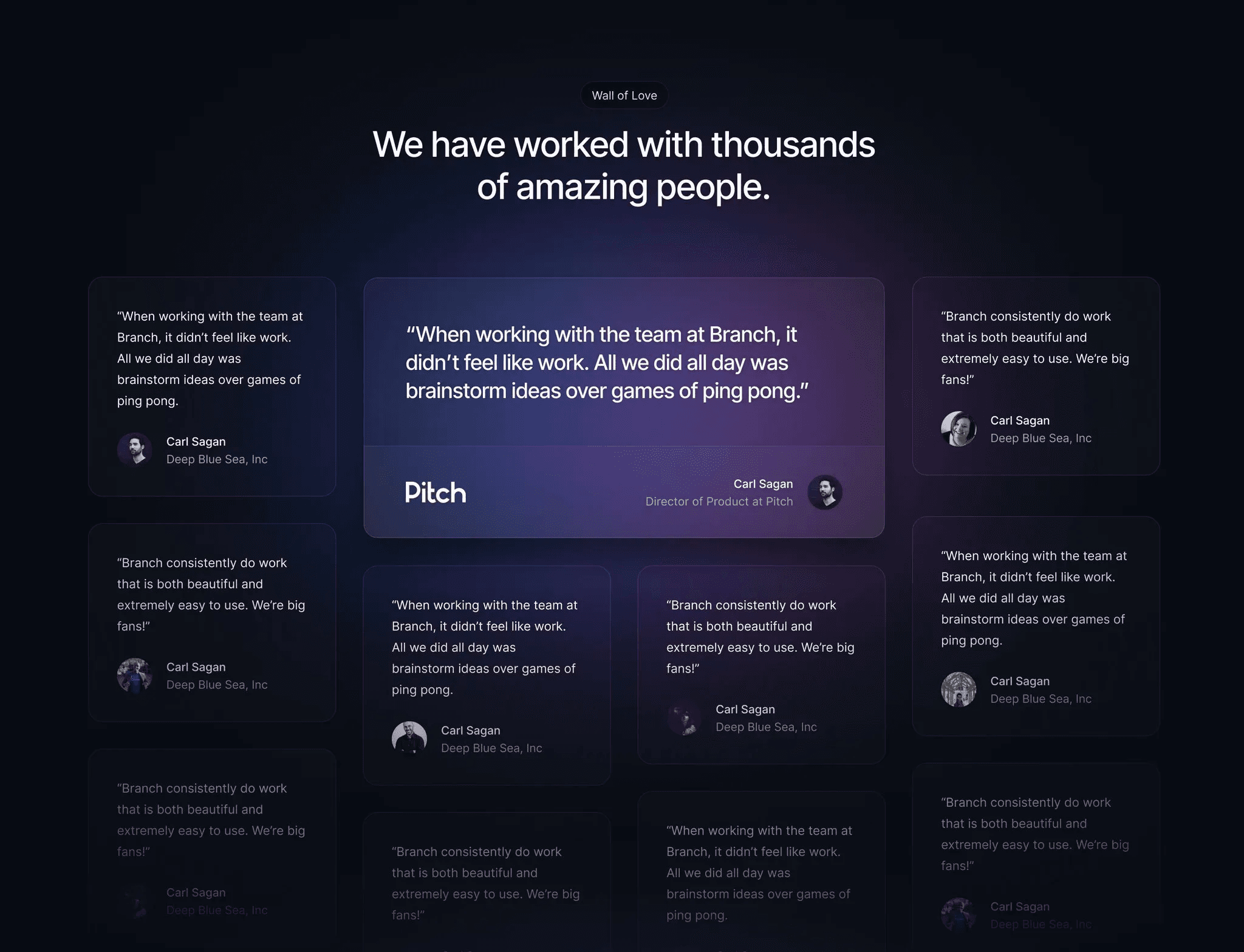
IMO this is a waste.
Because we’ve become desensitized to the wall of love.
Most people scroll past it as quickly as you just did ~10 seconds ago.
How to maximize the value of your testimonials
Instead of dumping testimonials into their own section, try finding ways to weave them into the core narrative of the page.
3-5 well-placed quotes can have more impact than 25 thrown in a grid.
Here are some examples 👇
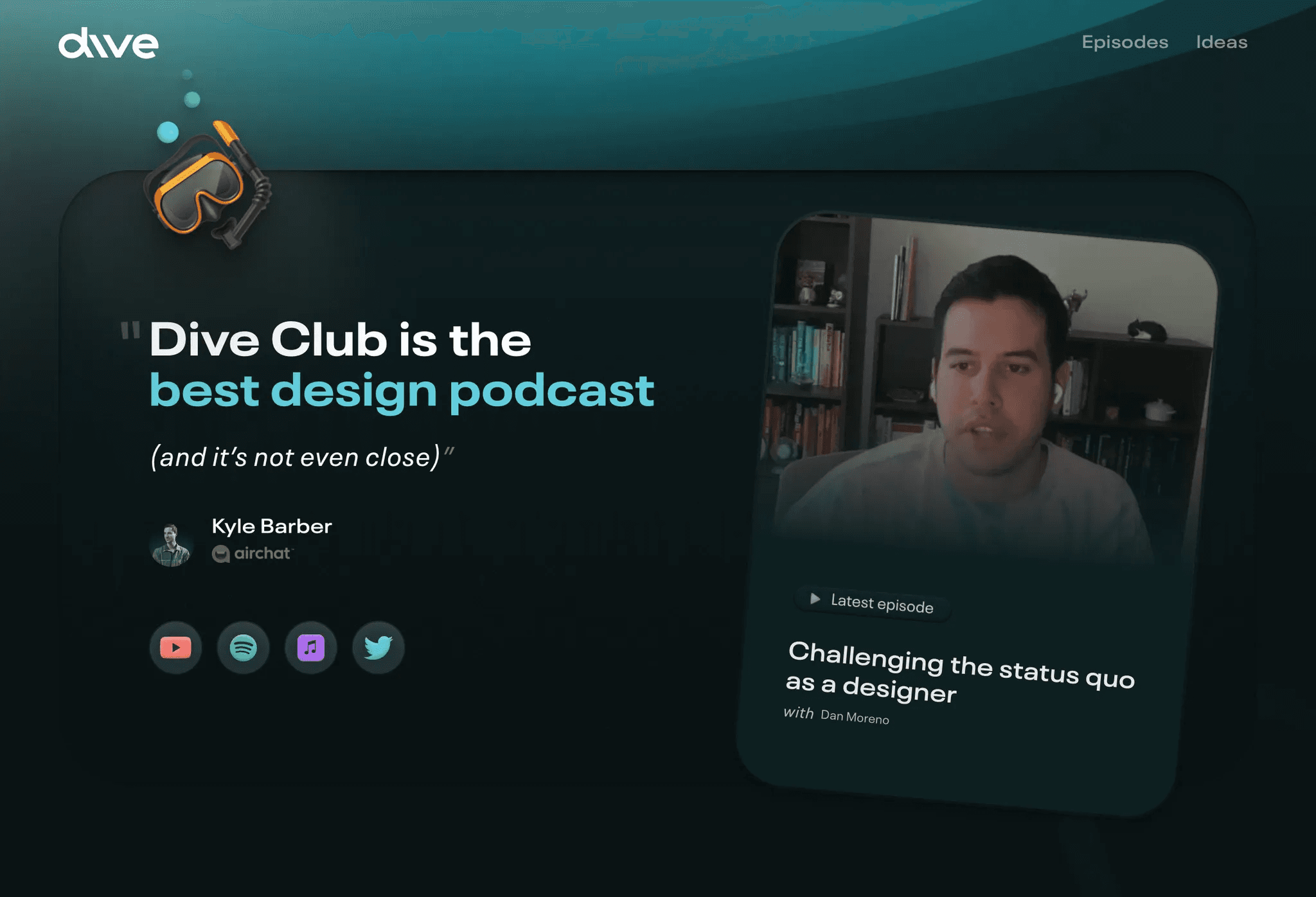
1 — Speaking in your user’s voice
Anything you want to communicate will be more impactful if it comes from a real person (vs. the marketing team).
Take the Dive home page for example… my goal was to make it 100% clear that this is a podcast for designers.
I could’ve easily written something myself, but making this quote from Kyle the main heading totally changes the feel. Now someone else is defining my offering.
Fey uses this approach on their new features page too.
Instead of writing copy themselves, they only showcase a testimonial and highlight “lightning-fast” as the value prop.

Look for opportunities to speak through your users (even if it means using testimonials as a heading or the only piece of text in a section).
2 — Leading with credibility
Once you scroll past the hero section, this quote is the very first piece of content on the Genway site.
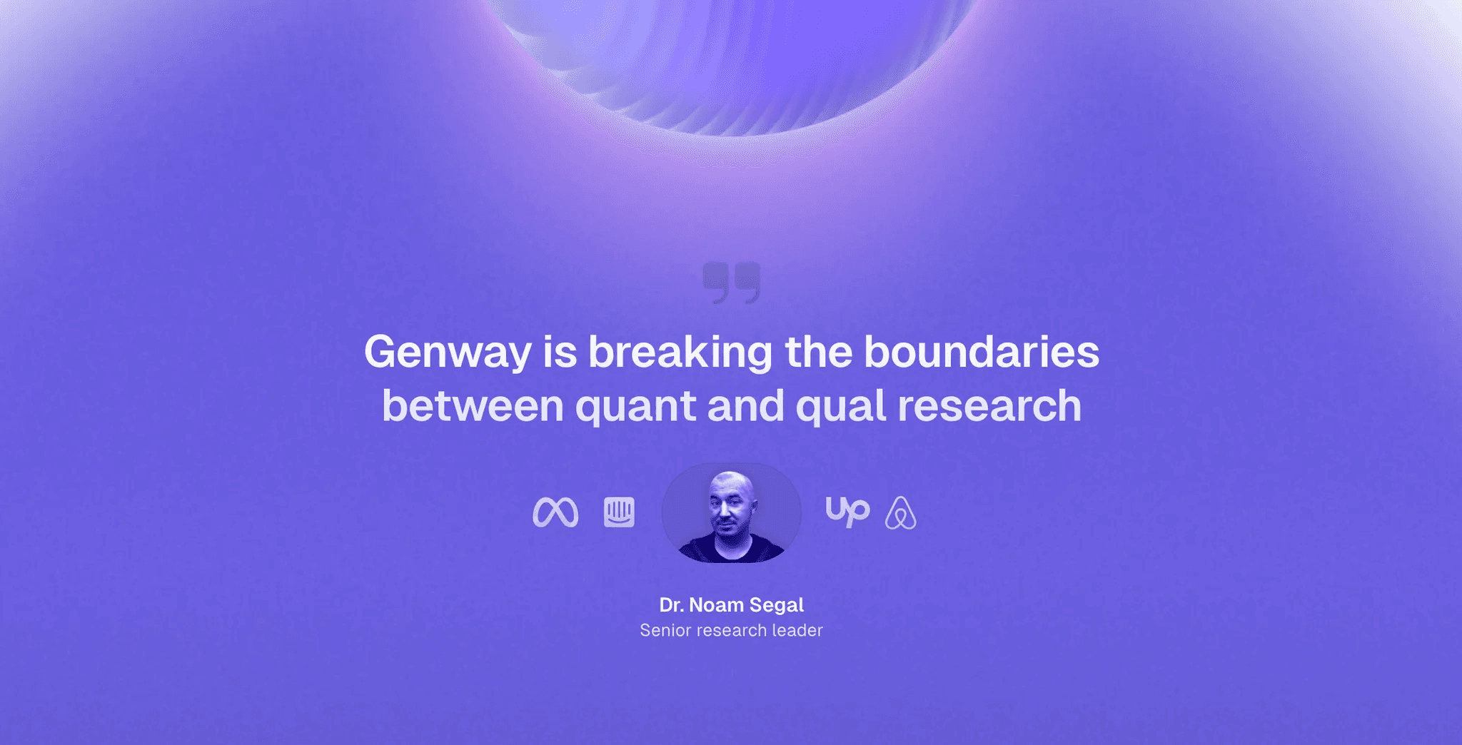
My goal is to make people think…
If a research leader from Meta/Intercom/Upwork/Airbnb is saying this is a big deal then I should probably pay attention to the rest of the site 🤔
This creates a lens of credibility for people to view the rest of the site through. So the higher up on the page it is, the more impact the testimonial can have.
3 — Providing supporting evidence
Years ago when I was designing the Teach on Maven page, I made sure each value prop had an accompanying testimonial.
The key is to find quotes that get as specific as possible.

Now when people are reading your site it’s as if your users are right there reinforcing everything you’re saying.
I used this exact same tactic on the new Genway site 👇

Skeptical of my examples?
That’s ok.
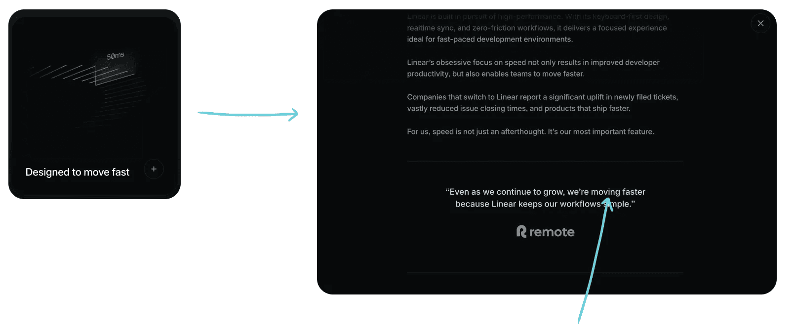
Just look at how Linear does it…
You won’t find a wall of love on their new website. But you better believe they have a hand-selected testimonial that supports each of their feature cards.
Notice the repeated use of “fast” 👇
4 — Strengthening your CTAs
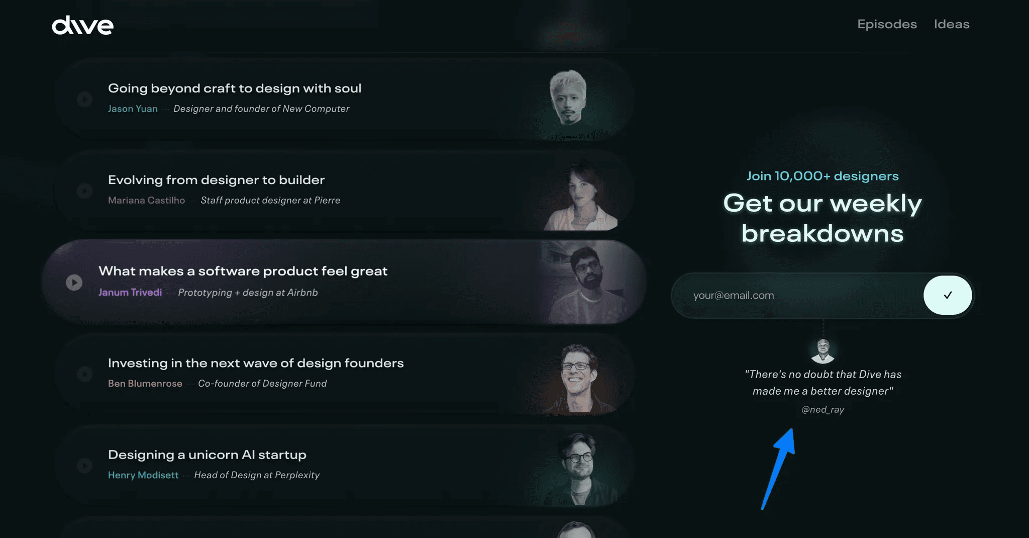
I like to think of the final 100vh of my page as a billboard of sorts. So one of my go-to patterns is to feature a testimonial above my closing CTA (like this).

You can apply this tactic anywhere though…
For example, I also like to nest quotes immediately under email signup components on the Dive website 👀
My rule of thumb
If I’m trying to communicate the SCALE of my user base, then having a wall of love is a great way to do that.
Take the Figma Academy website as an example…
This section has one goal: emphasize that 5,000+ designers have taken the course.
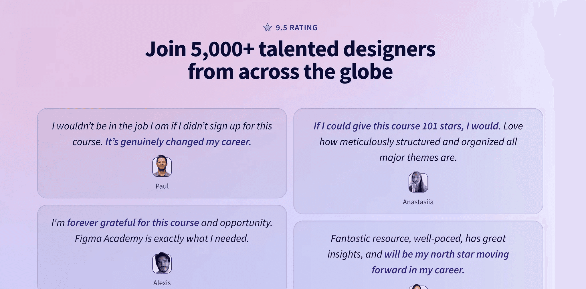
I have 0 expectations that anybody is going to read these quotes, and that’s ok! Their purpose is solely to reinforce the number 5,000.
On the other hand, there are times where I use testimonials to emphasize the core narrative of the page… like this quote strategically placed directly above my curriculum overview 👀

I LOVE that quote!
So I would never waste it by dumping it into a wall of love where nobody is going to read it 😬
My challenge to you
Take ownership of your testimonials database.
Too many designers think “oh that’s the marketing person’s job”.
I’m constantly writing down quotes during user interviews and asking people for permission to feature them.
These are the most valuable content assets that you have at your disposal!
Not only is it your job to create designs that maximize their value… I’ll suggest that testimonials should be one of the first elements you build your designs around.