Oct 17, 2024

How Airbnb is investing in design innovation

Creator of Dive

VP of Design at Airbnb

Too many designers think solely in terms of screens and flows.

You have to think about this part deeply but there’s so much more to the experience”
Teo Connor

If you want to use design to elevate your product then you have to find ways to push past utility and create something that people truly enjoy using.

That’s why Airbnb is making a concerted effort to introduce:

  • More haptic feedback

  • More motion interactions

  • More 3D

Investing in tactility

The longer you stare at these filter icons the more impressive they become 👀
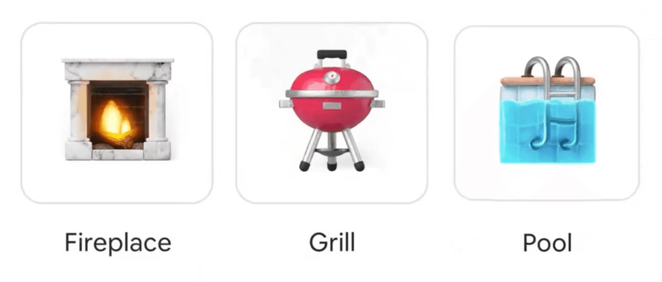
But Airbnb isn’t just investing in 3D for these more custom pictograms. They’re looking for every opportunity they can to make the app more tactile.

Let’s look at some dialogues as examples…

It would’ve been so easy to add simple, flat icons here 👇
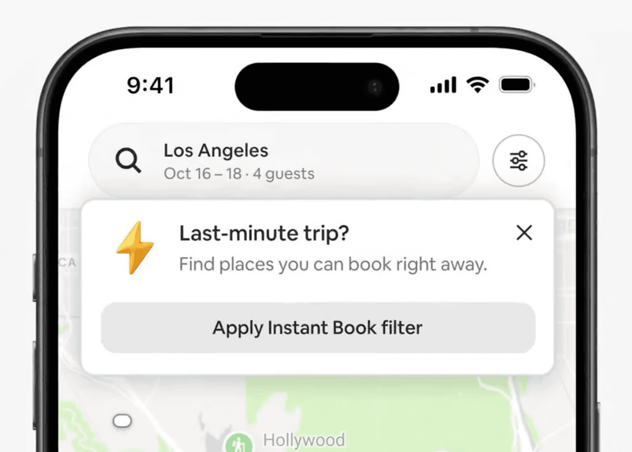
How many times have you opened Phosphor in Figma and searched for a lightning bolt or a tag icon? Maybe you spice it up a bit by throwing your icon in a nice circle container with a bit of padding 😅
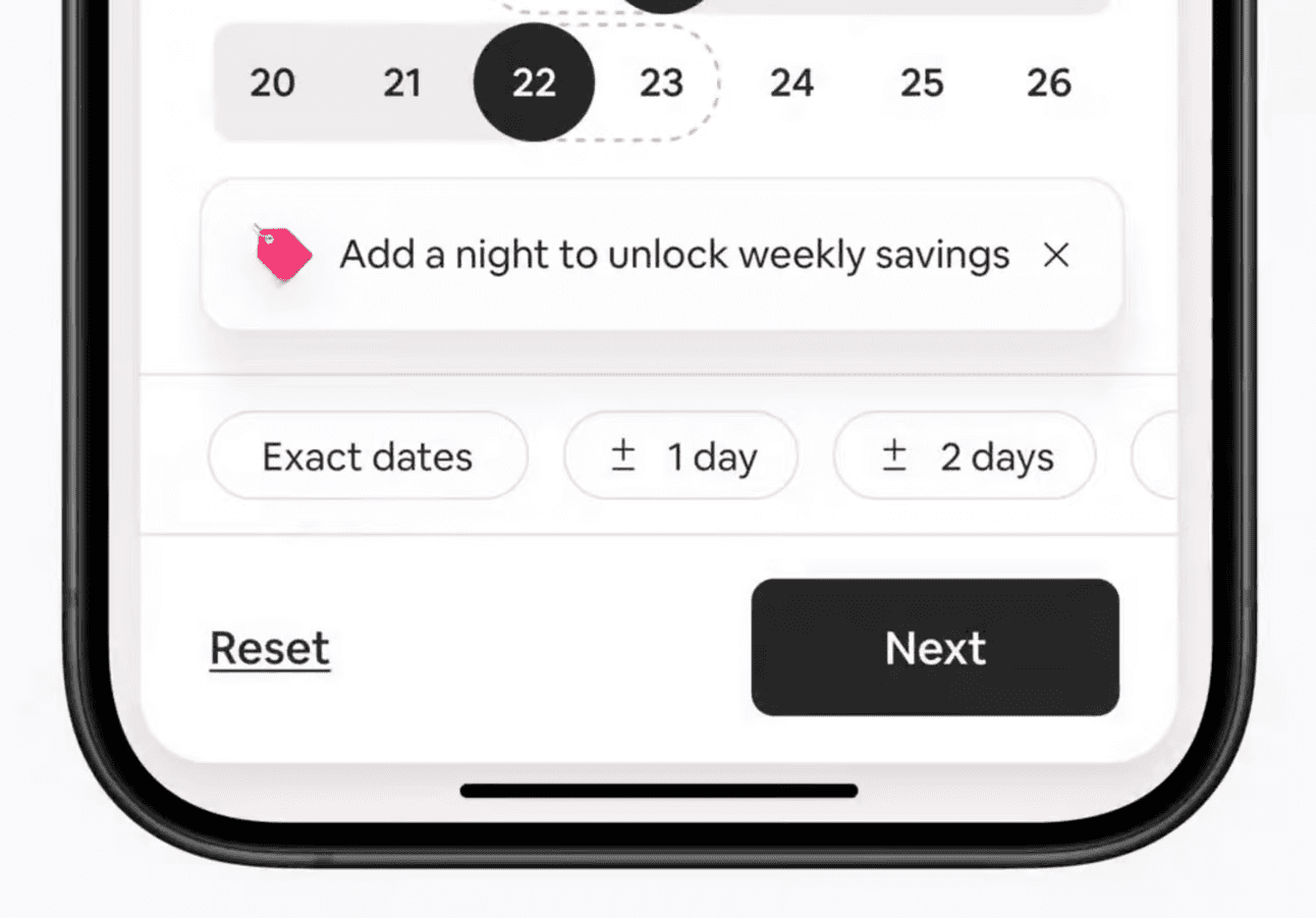
But Airbnb is actively fighting against flat design… and it’s beautiful 🤗

Investing in animation

Airbnb is making a strategic decision to move into the prototyping phase much earlier in the product development process.

“You only understand when a design is going to work when you see it on a device and you’re actually playing around with it”
Teo Connor

It’s a big reason why they’re hiring prototyping specialists like Janum Trivedi (and why I'm so excited about Play).

Exploring interactions in code early in the process empowers designers to dream up more ambitious ideas.

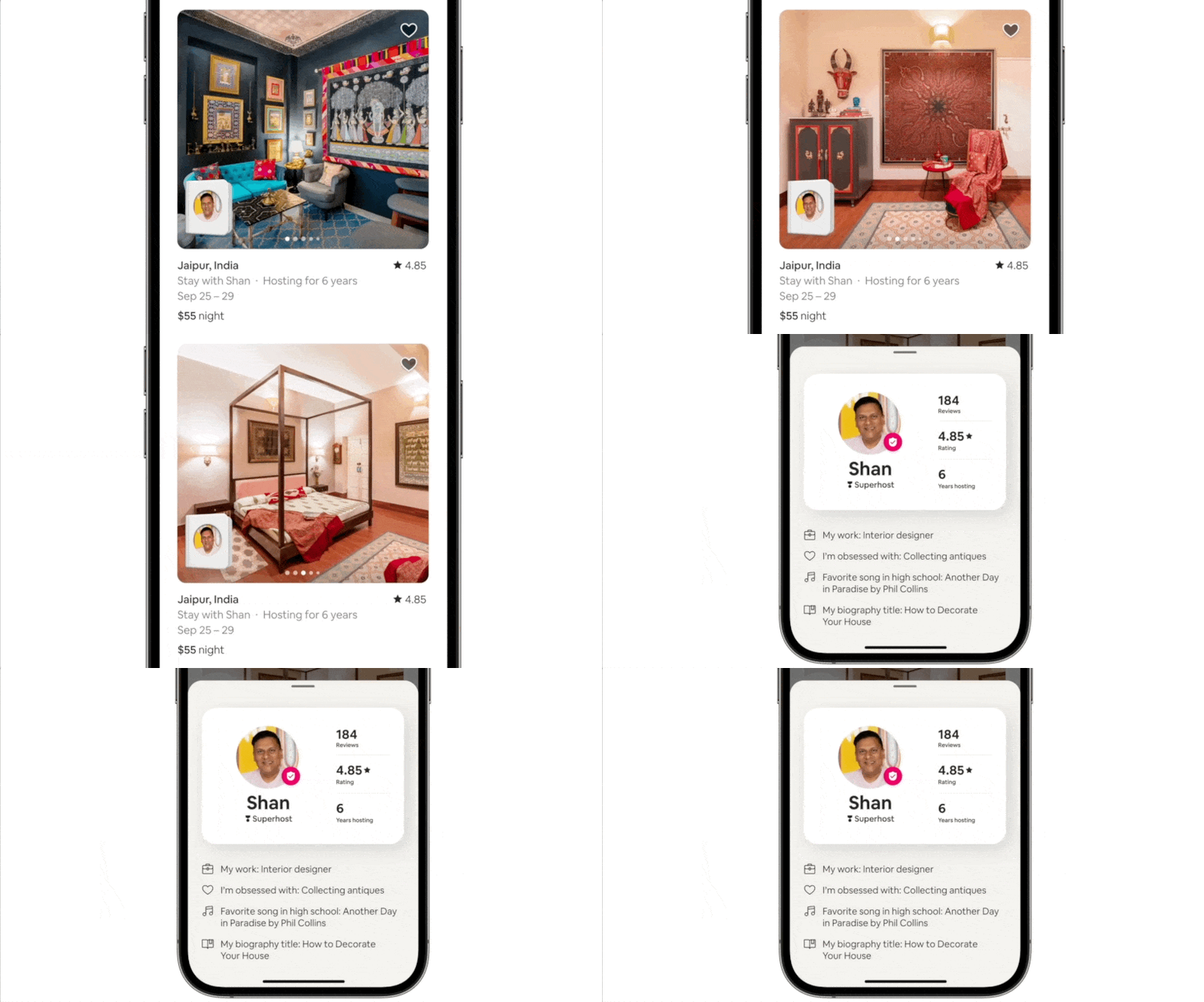
It’s how you end up with something like this passport animation, which Teo admitted “has to be super fluid for it to make sense otherwise it’s going to be awful” 😅
Investing in leaders

Transforming culture starts with leadership. That’s why Teo is intentionally bringing in design leaders who are not just people managers.

If you want to “empower designers to be designers”, then you need leaders who know what they’re talking about and are responsible for upholding craft.

The best design leaders keep their hands in the clay.

Go behind-the-scenes with Airbnb's VP of design

Airbnb dropped a banger yesterday 💥 

So this week’s episode is a behind-the-scenes with their VP of Design, Teo Connor. We go deep into:

  • How Airbnb is bringing vitality to the visual language

  • How Airbnb is empowering designers to be designers

  • How to succeed in a design review with Brian Chesky

  • Why it’s not enough to think in terms of flows and screens

  • Why Airbnb is updating their design system to use more 3D

  • How they redesigned the checkout and welcome experience

  • Why Airbnb has prioritized prototyping in code earlier in the process

  • + a lot more

Listen on YouTube, Spotify, Apple, or wherever you get your podcasts 👇

Join 10,000+ designers

Get our weekly breakdowns

"There's no doubt that Dive has made me a better designer"

@ned_ray

Join 10,000+ designers

Get our weekly breakdowns

"There's no doubt that Dive has made me a better designer"

@ned_ray

Join 10,000+ designers

Get our weekly breakdowns

"There's no doubt that Dive has made me a better designer"

@ned_ray

"

I've been binging Dive Club lately and the quality is nuts

Literally the only show about design I watch”

Eugene Fedorenko

"

I've been binging Dive Club lately and the quality is nuts

Literally the only show about design I watch”

Eugene Fedorenko

hello@dive.club

Ⓒ Dive 2024